finding my flow with markdown
finding my flow with markdown
inch my inch, row by row, gonna make my coding flow
I am in the class Collaborative and Reproducible Data Science in R this semester and thought it would be great to practice some of the skills I am learning in the class by adding more content to my website
I hope that this will help me progress with my coding/programming skills while providing me with material to look back on during my journey.
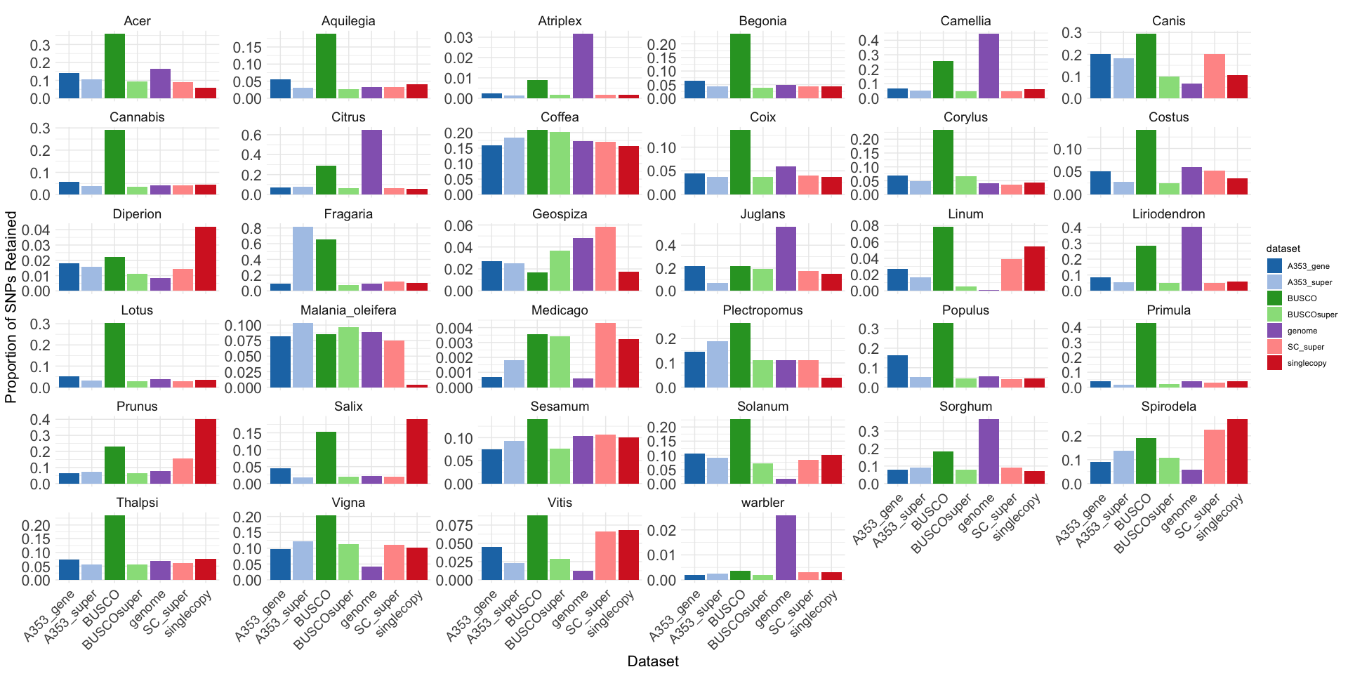
Check out this plot that I made in R to help me compare the
proportion of SNPs retained before and after filtering for LD. 
if you are wondering what the script looks like, check it out
below!
library(ggplot2)
library(readr)

# Load the data from the CSV file
data <- read_csv("/Users/joshfelton/Desktop/tests/tables/CORRECT_SNPS_after_filtering.csv", show_col_types = FALSE)

data$proportion <- data$snps_after_filtering/data$fasta_charachters


# Define custom colors for each dataset
custom_colors <- c(
  "A353_gene" = "#1f77b4",   # Blue
  "A353_super" = "#aec7e8",  # Light Blue
  "BUSCO" = "#2ca02c",       # Green
  "BUSCOsuper" = "#98df8a",  # Light Green
  "singlecopy" = "#d62728",  # Red
  "SC_super" = "#ff9896",    # Light Red
  "genome" = "#9467bd"       # Purple
)

# Create the faceted bar plot with custom colors
ggplot(data, aes(x = dataset, y = proportion, fill = dataset)) +
  geom_bar(stat = "identity", position = "dodge") +
  facet_wrap(~ organism, scales = "free_y") +
  scale_fill_manual(values = custom_colors) +
  theme_minimal() +
  labs(title = "Comparison of SNPs Proportion Retained After Filtering",
       x = "Dataset",
       y = "Proportion of SNPs Retained") +
  theme(
    axis.text.x = element_text(angle = 45, hjust = 1, size = 14),  # Increase x-axis text size
    axis.text.y = element_text(size = 16),                        # Increase y-axis text size
    axis.title.x = element_text(size = 16),                       # Increase x-axis title size
    axis.title.y = element_text(size = 16),                       # Increase y-axis title size
    strip.text = element_text(size = 14),                         # Increase facet labels size
    plot.title = element_text(size = 0, hjust = 0.5)             # Increase plot title size and center it
  )
obviously, the script still needs some modification, and I need to add more data, but I must say, I really like sharing results and figures through markdown!